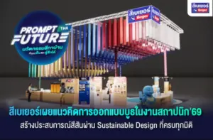
In the world of architecture, “color” is not just a decorative element, but a part of the design that affects both the feelings, space, and experiences of the users. The important question is not just “What color should I choose?” But it is “What can colors communicate?” Therefore, within the eventArchitect 2026Bayer presented this concept through the booth design that transforms “materials” into “a language of communication” by using “8 turtles” as a medium for storytelling.
Color as the “language of materials”
What is interesting within the booth is that it does not start by directly explaining the product features, but instead chooses to tell the story through “design.” The eight turtles were created to represent different types of materials, using color, texture, and form as tools for communication. Each one does not just serve to attract attention, but functions like a “Visual Language” that helps translate complex information into immediate understanding.
When the surface tells a story of “strength”
One of the obvious elements is the use of different textures in each piece.
- Some reflect strength.
- Some models emphasize smoothness.
- Some models show the composition of multilayer materials.
These elements help the audience to “perceive the qualities” of the materials without having to read lengthy descriptions. It is an effective use of “images as words.”
When usage is narrated visually
Another standout point is the inclusion of “Action” in the design work, such as holding painting tools or poses that convey actual usage.
This helps the audience connect immediately that:
- What is this material used for?
- How to use it
- What situations is it suitable for?
From observation, it becomes understanding.
Color as a “system of thought”
Some parts of the design use color zoning along with icons to communicate ideas. This reflects that color is not just about aesthetics but can serve as “a system for explaining information.” From a design perspective, this is the application of UX/UI concepts to materials in the real world, making it easier for users to understand without needing prior knowledge.
When “heat” is designed to be visible
One of the concepts that is often difficult to understand is “heat” and its effects on buildings. Within the Bayer booth, this idea is presented through easily understandable elements such as
- Color tone
- Symbol
- Data arrangement
Allowing the audience to immediately understand how color and materials play a role in the “temperature of the space,” transforming abstract concepts into tangible elements.
The feeling of materials… understood without touch
Certain types of materials, such as woodwork, often require touch to perceive their quality. However, the design in this booth can convey the “feeling of materials” visually through
- Shades
- Gloss
- Surface details
What happens is that the audience can “feel” the materials even without actual touch.
Ultimately, what Bayer presents at the 2026 architect event is not merely a display of materials or products, but an experiment in re-questioning “color” as a design tool through a way of thinking that transforms communication from descriptions into images, from data into experiences, and from materials into a language that people can immediately understand. The eight turtles thus do not merely serve as creative elements within the booth but represent the idea that color, texture, and form can work together to convey meaning effectively without relying on complex explanations. In the context of contemporary design, where people have less time to absorb information, the ability to “make it understandable instantly” may become as valuable as the beauty of the design itself.