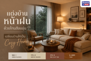

Why “Color Pairing for Homes” Can Transform a Simple House into an Expensive-Looking One
Have you ever seen some houses and thought, “Why do they look so expensive, even though the design is simple?”
The answer is — one of the secrets is “color pairing” or a perfect Color Palette.
Becausesometimes luxury doesn’t come from expensive items… but starts with“the colors you choose to paint.”
In simple terms, choosing the right “color pair” = a house that looks valuable + stylish + photogenic from any angle.
Popular color palettes for home painting that instantly elevate the look of your house
Color pairing formulas that designers love to use, and real homeowners confirm that “it looks significantly more expensive.”
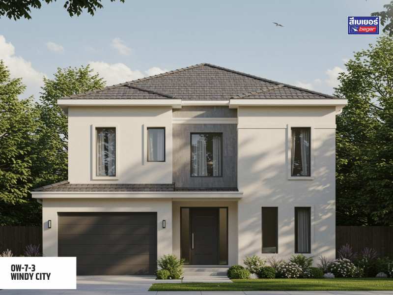
1. Ivory Cream and Light Gray – Luxurious yet subtle
The cream color is often called “timeless” because it gives a modern feel without being too harsh, making it suitable for minimalistic homes that want to look warm and easy on the eyes while still exuding elegance.
Tip from an expert
Try using light gray for the wall base and apply ivory cream around the door frames, windows, or crown moldings to achieve a dimension of light and shadow that looks expensive without increasing your decoration budget.
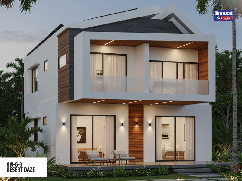
2. White, Natural Wood, and Matte Black – Sleek and luxurious like a resort
White gives a clean, airy feel.
Natural wood adds warmth, while matte black helps “lock in the premium feel,” making everything look calm and more expensive.
This combination is perfect for loft or modern tropical homes that want a sleek look without being too cold.
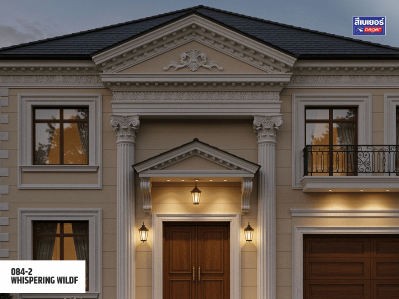
3. Beige, light gold, dark gray in a classic European luxury style
Beige provides softness / light gold adds luxury / dark gray helps balance and adds dimension
Highly recommended for resort-style homes or for those who love a warm yet elegant Mood & Tone
A little tip
Using light gold for crown molding or wooden door frames will enhance the feeling of “Luxury” without needing real gold materials!
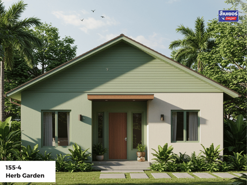
4. Green, muted white for a vibrant healthy home
Green is the trending grayish-green tone for 2025, providing a relaxing feel, suitable for Wellness Living homes or nature lovers
When paired with muted white, it creates an Eco-Lux harmony that looks both expensive and environmentally friendly
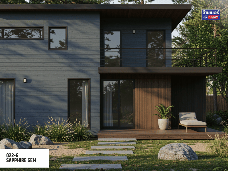
5. Blue-gray, dark brown, simple, cool, composed
Ideal for seaside homes or vacation retreats
Blue-gray gives a calming visual effect, while dark brown adds “framing” and solidity to the structure
3 tips for “color pairing” to make your home look expensive like a professional
| Problem | Recommended color pairs | Results |
| Small / narrow space homes | White + soft pastels | Looks wider and more spacious |
| Homes with strong sunlight / heat | Light gray + cool colors Beger Cool | Reduces indoor temperature |
| Homes with many gardens | Muted green + cream | Harmony with Nature |
| Two-story house looks solid | Light-dark tone contrast |
Add dimension, not flatness |
Pro Tip : Don’t forget to consider the “direction of sunlight” in your home. Some light tones may appear darker or lighter depending on the time of day.
From the perspective of Beger experts
“The expensive-looking color does not depend on the price… but on the pairing and understanding the mood of the space.”
- For the exterior, we recommend BegerShield 2In1 or BegerCool DiamondShield 15 — heat-resistant house paint that helps reduce electricity bills.
- For the interior, use BegerShield AirFresh Gold Ion Zero VOCs, a VOC-free paint safe for children and pets.
A luxurious-looking home doesn’t require expensive materials, just “choose the right color combination.”
- Choose a color combination that balances “warm” and “cool.”
- Add dimension with light, shadow, and texture using accent tones.
- Use high-quality paint like Beger to ensure beautiful shades that last and do not yellow.
FAQ about house color combinations
Q1: What color combinations can instantly make a house look more expensive?
A: Ivory cream–light gray, beige–light gold–dark gray, and white–matte black–natural wood are palettes that instantly elevate the luxury of a home by balancing warmth and elegance at the same time.
Q2: What color tones should small houses use to appear larger and brighter?
A: Choose light tones such as white, pastels, or light gray, as they reflect light well, making the space look larger, airy, and not cramped.
Q3: What are Low VOCs, and why are they suitable for modern homes?
A: Low VOCs are volatile organic compounds that affect the nervous system and respiratory tract. Paints with low VOCs have no pungent smell and help reduce indoor pollution, making them suitable for health-conscious and environmentally friendly homes.
Q4: What type of paint should be chosen for homes exposed to strong sunlight to ensure durability and prevent fading?
A: Choose exterior heat-resistant paint that meets the Thai Industrial Standards (TIS) 2514 – 2564 (heat-reducing emulsion paint) such as BegerShield 2In1 or BegerCool DiamondShield 15, which reflects UV rays, helps reduce wall temperature, and prolongs the lifespan of the paint.
Q5: How should one choose a color palette to match the style and materials of the house?
A: Consider the main tone of the materials, such as the roof, tiles, or wood, and choose a color pair that balances between warm and cool tones to make the house look harmonious and beautiful throughout. Alternatively, you can consult directly with our professional designers. You can contact the Color Design department at 02-611-3434 ext. 260 or Line ID: 0800619041