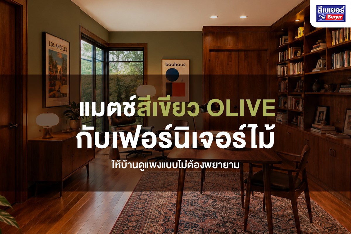
Olive Green pairs best with warm brown wooden furniture because both colors have roots in nature and share a warm undertone. When placed together, they create a “calm luxury” feel without the need for expensive items. The key to matching is to use Olive Green walls as a backdrop, allowing the wood grain to take center stage, complemented by cream, brass, and a touch of contrasting colors.
Why does Olive Green pair well with wooden furniture?
Because Olive Green and brown wood tones are “next to each other” on the color wheel (analogous colours) and both have warm undertones. Our brains automatically read them as a cohesive color set. This is why rooms with Olive walls and wooden furniture often appear calm, mature, and more expensive than they actually are. Olive is also a green that contains yellow and gray, making it less bright and harsh on the eyes compared to mint green or leaf green. This slight dullness gives it a “luxurious” look and is a color frequently used by interior designers in Mid-century and modern Japanese styles.
What is Olive Green and how does it differ from other greens?
Olive Green is a yellowish-grayish green named after the color of olives. It is a “muted” and warmer green than typical greens. This is what distinguishes it from bright or cool greens, and it is the reason it pairs particularly well with wood and leather.
| Green tones | The mood they convey | Does it match with wood? |
|---|---|---|
| Olive Green | Calm, warm, looks expensive, mature | Matches well (warm undertones align) |
| Sage Green | Soft, gentle, brighter than Olive | Pairs well, especially with light wood |
| Emerald Green | Luxurious, bold, dramatic | Matches with dark wood/brass |
| Mint Green | Fresh, cool, youthful | Matches less (cool tones contrast with warm wood) |
What wood tones should I pair with Olive Green?
All warm wood tones pair well with olive, but the results vary depending on the wood’s intensity. The darker the wood, the more luxurious and classic the room appears. The lighter the wood, the more airy and fresh the room looks. Choose according to the mood you want to achieve like this.
| Wood Tone | Creates a mood of | Suitable for room |
|---|---|---|
| Walnut (dark) | Luxurious, classic, formal, looks the most expensive | Office, living room |
| Oak/Teak (medium) | Warm, balanced, easiest to use | Any room |
| Light wood/Natural wood | Airy, fresh, Scandinavian/Japanese style | Bedroom, reading nook |
3 color pairing formulas for olive green with wood, practical for the whole house
Below is a set of Beger colors that have been paired for you, categorized by room. Grab the color codes to order mixes at the Beger color mixing center. All formulas use Arapaho Valley (079-6) as the main olive green color; only the pairing color and wood tone change to suit the room.
Living room: Olive, Teak wood, and light blue
This formula gives the room an airy and warm feel at the same time. The olive walls contrast with the slightly grayish blue fabric chairs, helping the room feel neither heavy nor lacking in a warm minimalist taste.
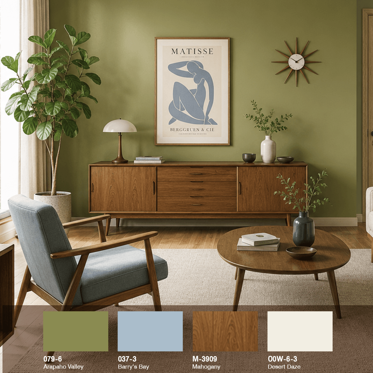
| Color Code | Color Name | Where to use |
|---|---|---|
| 079-6 | Arapaho Valley (Olive Green) | Main Wall |
| 037-3 | Barry’s Bay (Light Blue) | Sofa/Chair Decorative Items |
| M-3909 | Mahogany (Wood) | Cabinet Coffee Table Furniture |
| 00W-6-3 | Desert Daze (Cream) | Fabric Decorative Items Curtains |
Bedroom: Olive Walnut Wood and Terracotta
Want a bedroom that feels warm and safe? Use Olive combined with Walnut wood and terracotta color for a complete earth tone set, giving a resort-like atmosphere.
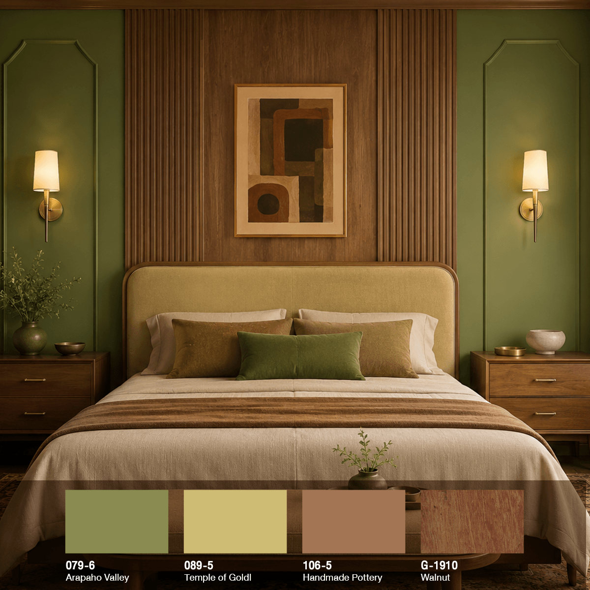
| Color Code | Color Name | Where to Use |
|---|---|---|
| 079-6 | Arapaho Valley (Olive Green) | Side Wall/Headboard |
| 089-5 | Temple of Gold (Golden Yellow) | Headboard Bedspread Pillow |
| 106-5 | Handmade Pottery (Terracotta) | Cover Decorative Items |
| G-1910 | Walnut (Walnut wood) | Wooden wall, bedside cabinet |
Office: Olive, dark walnut, and indigo
For the office, I wanted a calm and focused atmosphere. I used olive paired with dark walnut and indigo, adding a touch of terracotta orange to lighten it up a bit. This created a space that feels serious but not stressful.
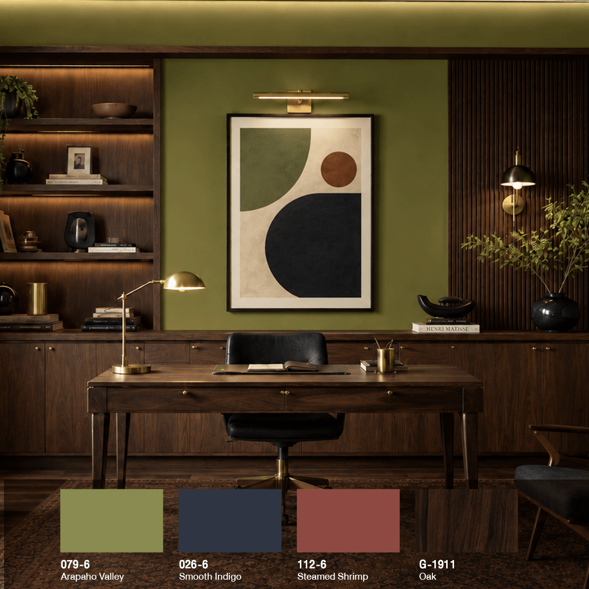
| Color Code | Color Name | Where to Use |
|---|---|---|
| 079-6 | Arapaho Valley (Olive Green) | Main wall |
| 026-6 | Smooth Indigo (Indigo) | Decor, art pieces |
| 112-6 | Steamed Shrimp (Terracotta Orange) | Accent points/small accents |
| G-1911 | Oak (Oak wood) |
Table, bookshelf |
5 Techniques to Make Your Space Look “Expensive” Effortlessly
The look of “expensiveness” does not come from high-priced items but from harmony and small details. These 5 tips can be implemented immediately without needing to renovate the room.
- Follow the 60-30-10 rule: Main color (Olive) 60% / Secondary color (Wood) 30% / Accent color 10% to avoid a dull or cluttered room
- Add texture, not color: Linen, pronounced wood grain, woven rugs, and matte brass help give the room more dimension than just adding a lot of color.
- Use warm tone lighting (2700–3000K): Olive and wood look best under warm light. White light will make olive appear dull and muted.
- Leave space for the eyes to rest: Don’t fill every corner with items. Empty space on olive walls is what makes the room look expensive and sophisticated.
- Hang one piece of art that has colors in the same palette For example, an olive-toned terracotta poster will help tie the color scheme of the entire room together.
Common mistakes people make when matching olive colors
- Painting all four walls olive without an accent color The room will look dark and cramped. At least one wall or ceiling should be a lighter tone.
- Pairing olive with cool-toned wood (blue-gray) The undertones will clash, making the room look dull and lifeless. Warm-toned wood should be chosen instead.
- Using too many accent colors More than 3 main colors will start to clutter the room. Stick to 60-30-10 for now.
- Forgetting to test the actual color on the wall Olive changes appearance significantly with light. Samples should be painted and viewed both during the day and at night before making a decision.
FAQ Frequently Asked Questions about matching olive green with wooden furniture
Q1: What wood color goes best with olive green?
A1: It goes best with warm-toned woods, especially walnut, oak, teak, and mahogany, as they have warm undertones that match olive. Avoid wood that is dyed with blue-gray tones as they will clash and look dull.
Q2: Can a small room be painted olive green? Will it look dark?
A3: Yes, but you should only paint one wall as an accent wall and keep the remaining walls and ceiling in a light cream tone. Using warm lighting will make the small room feel cozy and deep without being cramped.
Q3: Which Behr color number is olive green?
A3: The easy-to-use and mid-tone olive is Arapaho Valley, code 079-6. It is a yellow-green-gray that is neither too dark nor too light, and it pairs well with almost any wood tone.
Q4: Does decorating a home in olive tones require a lot of money to look expensive?
A4: Not necessarily. The expensive look comes from the harmony of colors and textures, not the price of furniture. Just keep the color palette within the 60-30-10 rule, add texture and warm lighting, and you’ll achieve the desired effect.
Recommended Products
Summary
Matching olive green with wooden furniture is a shortcut to making a home look expensive without effort, as both are warm natural tones that complement each other. Just adhere to the 60-30-10 rule, choose warm-toned wood, and add texture and warm lighting, and an ordinary room will instantly look elevated. Ready to get started? Begin by selecting your favorite olive color code and then order the paint mix at the Behr Color Design center.