
Creating a home that looks “premium” or “luxurious instantly” does not always depend on the budget. Many times, what makes the most significant difference is “the smart choice of colors.” And among all the colors, ““Gold” is one of the most powerful colors to elevate a home to look more expensive instantly. Whether it’s a small house, a condo, or a detached house, simply adding golden details in the right spots can transform the atmosphere from “ordinary” to “Luxury.”
Impressively, many people are still hesitant to use gold because they worry it might look too much, be too flashy, or if used incorrectly, their home might not look expensive. But the truth is that Whether gold looks luxurious or not does not depend on the color, but on the “way it is used.” If used in the right position, choosing the appropriate shade, and perfectly matching colors, gold can become the most powerful “premium enhancer” in the home. This article will guide you from the basics to professional techniques, including how to use gold to look luxurious, how to match colors perfectly, and how to select high-quality gold that helps your home look beautiful “for a long time, not just beautiful at first.”
Why does “gold” make a home look luxurious and premium?
Gold is a color that has deep meanings in psychology and culture since ancient times. Gold has been used in high architecture, such as palaces, churches, and important buildings, because it represents wealth, success, and elegance. When used in homes, gold automatically helps create these feelings.
The highlights of using gold in home decor.
- Make your home look “more valuable”
- Add dimension through light reflection.
- Make the space look bright and warm.
- Create a focal point for the eyes.
The important thing is Gold color doesn’t need to be used a lot, but it must be used “in the right spot.”
Techniques for Using Gold Color to Make Your Home Look Luxurious
Many people make the mistake of “using too much,” which makes the house look gaudy instead of elegant.
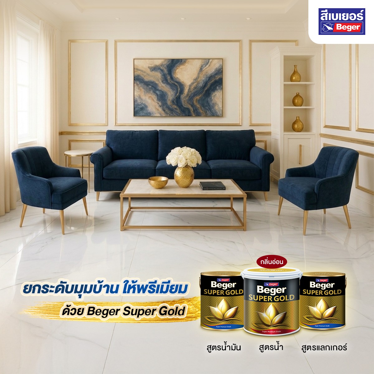
1. Use gold as an accent.
Instead of painting the entire room, choose to use it only in specific areas, such as
- TV wall
- Door / Window Frame
- Post or cornice
Key Technique: Use only 10–20% of the area
2. Use gold color to highlight details and make the house look expensive.
Small details make a difference, such as
- wall moldings
- stucco patterns
- handrails
When gold is added, these elements immediately stand out.
3. Choose a shade of gold that suits your style
- glossy gold luxurious, striking
- matte gold calm, minimal
- rose gold classic, warm
Choosing the right shade is what makes a home “look truly expensive.”
What colors go well with gold? A formula to make your home look premium.
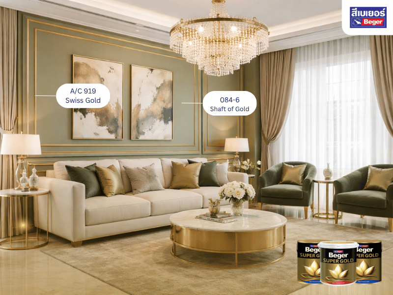
gold and white
look: luxurious, clean, easy on the eyes, suitable for Modern Luxury style homes
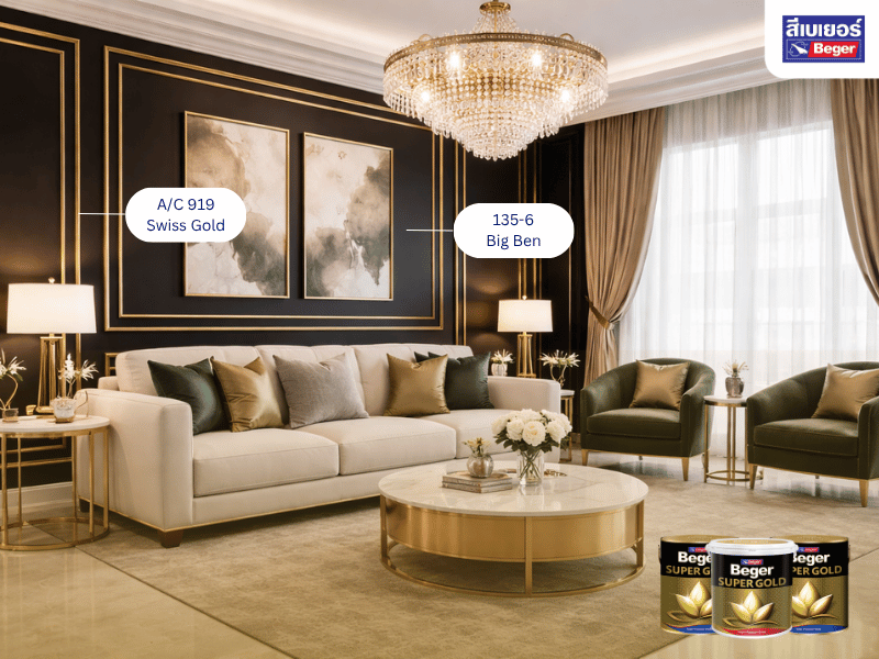
gold and black
look: luxurious, cool, powerful, suitable for those who want to stand out
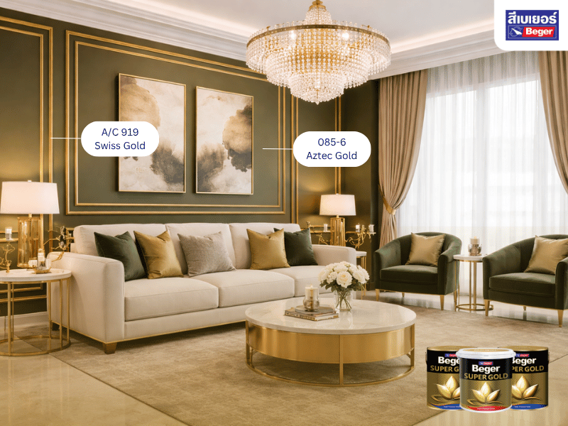
gold and dark green
look: Royal, European luxury, giving a classic feel
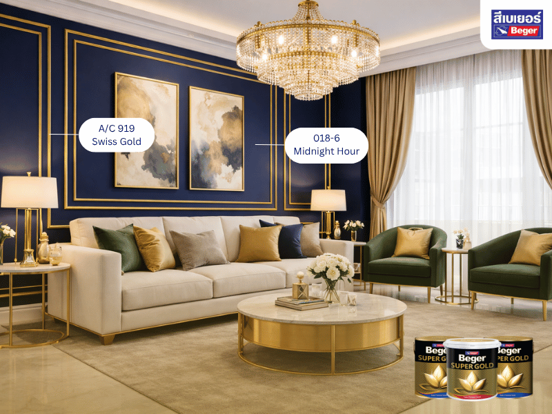
gold and dark blue
look: calm, sophisticated, suitable for an office
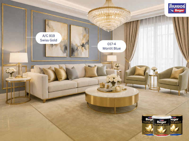
gold and gray / beige
look: Minimal Luxury, simple yet expensive-looking
Ideas for Decorating Your Home with Gold That Deliver Real Results
If you want your home to look premium quickly, start with the “spots that people see first,” such as
- the headboard wall
- the wall behind the TV
- the entrance hall
- showcase columns
- the staircase railing
These areas create the First Impression that makes a home look luxurious at first glance, or we often see people who believe in the color gold using it to decorate their homes to enhance feng shui.
Which shade of gold should you choose? Something many overlook
The problem with regular gold paint is
- it fades quickly
- it doesn’t shine genuinely
- it peels easily
- it can’t be used outdoors
which makes the home look less premium in the long run.
How is high-quality gold paint different from regular paint?
High-quality gold paint will have
- high-quality metallic powder
- deep shimmer with dimension
- resistance to sun and rain
- suitable for various surfaces
This is what makes “the work look truly expensive.”
Recommended premium gold for professional-grade decoration
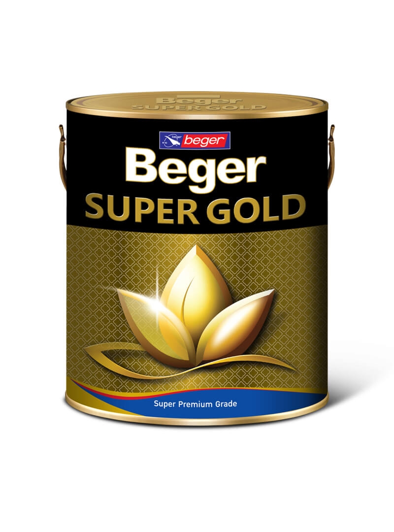
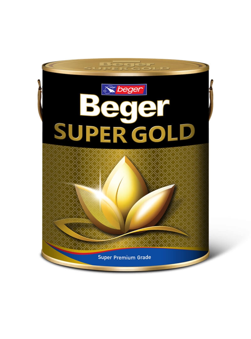
If you want a truly Luxury result. Beger Super Gold (oil-based formula, water-based formula, and lacquer formula) is the perfect choice
Highlights
- special golden konjac powder from Switzerland
- provides a realistic shiny gold sparkle
- resistant to sun and rain for up to 15 years
- available in oil-based, water-based, and lacquer formulas
- suitable for cement, wood, and metal
helps beautify both the interior and exterior of the house while maintaining long-lasting shine
tips to make the gold color look more luxurious
- pair with marble or glass
- use Warm Light
- do not use multiple shades in one spot
- focus on less but clearer
gold is the “shortcut” to elevate your home to a premium look; just use it in the right places, match colors appropriately, and choose high-quality colors, and an ordinary house can instantly become a luxurious home
Recommended products
Swiss Gold: bright gold tone
|
Beger SUPER GOLD A/E 234 |
Beger SUPER GOLD A/C 919 |
Beger SUPER GOLD A/L 123 |
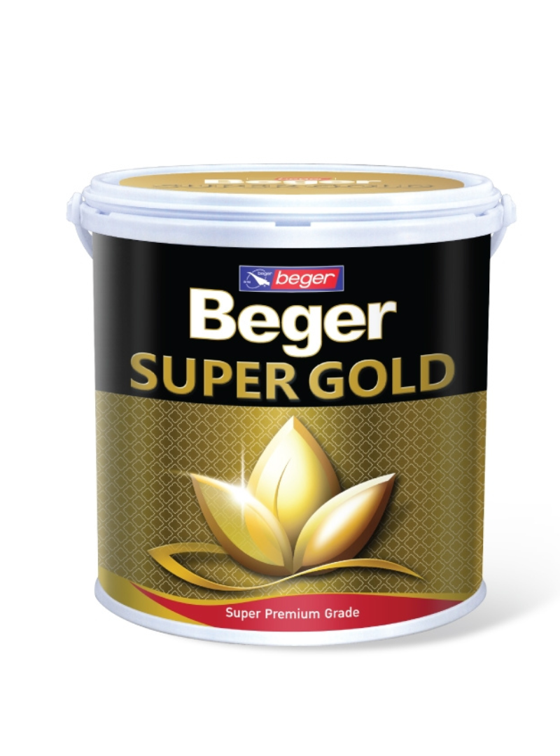
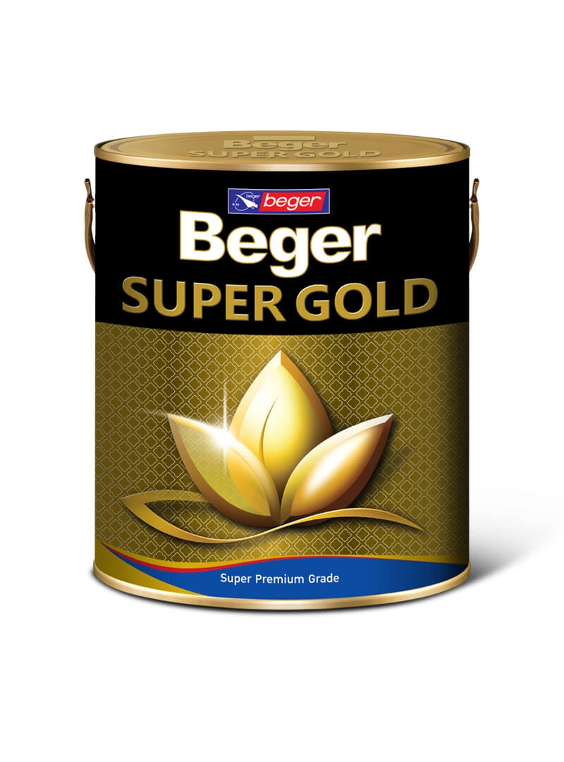
European Gold: dark gold tone
|
Beger SUPER GOLD A/E 303 |
Beger SUPER GOLD A/C 707 |
Beger SUPER GOLD A/L 202 |
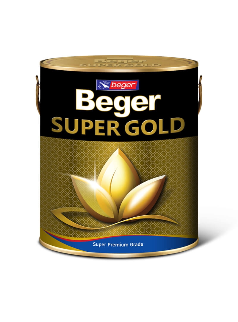
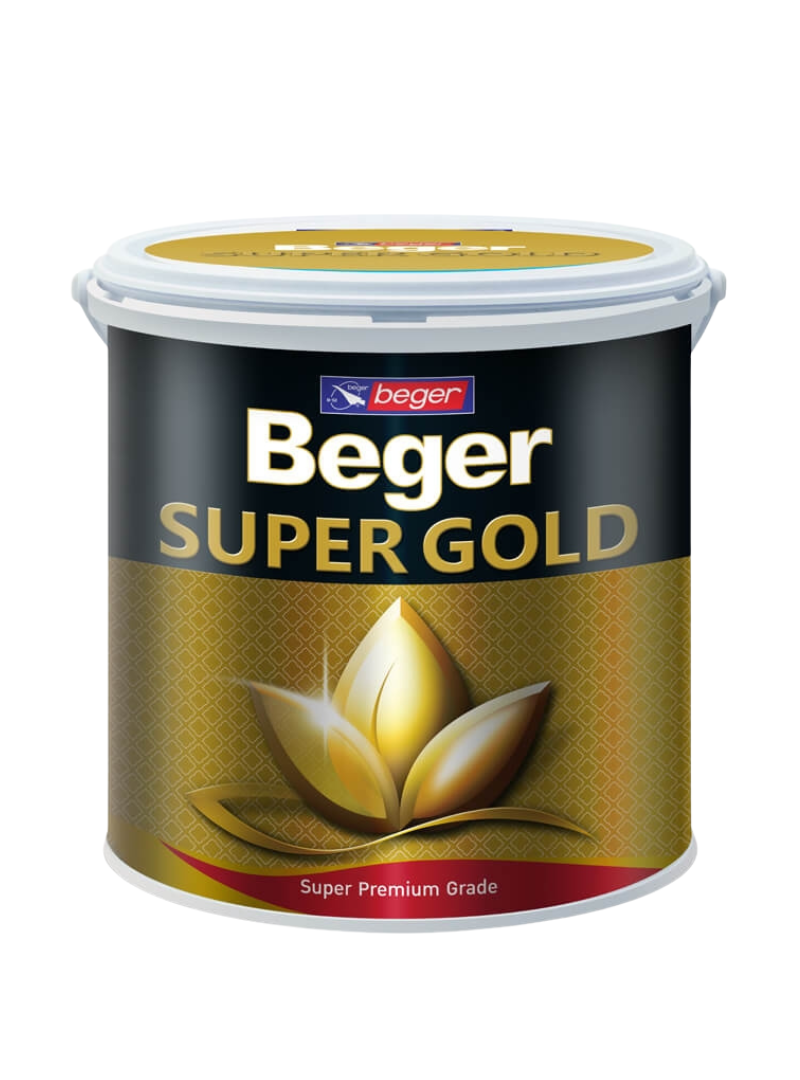
FAQ Frequently Asked Questions about Gold Home Decoration
Q1: What type of gold for home decoration should I use to avoid it looking too much?
A1: To make gold look premium, it should be used as an “Accent” or focal point, such as on certain walls, wall moldings, or door frames, using about 10–20% of the total area. This will help the home look luxurious without being gaudy.
Q2: What style of home is gold suitable for?
A2: Gold can be used with various styles, such as Modern Luxury paired with white or black, Classic paired with cream, brown, or warm gold, and Minimal Luxury paired with gray or beige, depending on the choice of shade and color pairing to suit the design.
Q3: Can gold be used outside the house?
A3: Gold can be used outdoors if the color has properties that withstand sunlight, rain, and do not fade easily, such as high-quality metallic powder paints designed specifically for outdoor use.
Q4: What colors go best with gold?
A4: Gold pairs well with many colors, such as
–white luxurious, clean
–black luxurious, bold, powerful
–dark green Royal Classic
–Deep Blue Sophisticated and Elegant
– Gray / Beige Sleek and Modern
Q5: What shade of gold should I choose to look truly expensive?
A5: You should choose a gold shade that has a realistic shimmer, a deep luster, is not prone to fading easily, and withstands weather conditions well. In particular, colors that contain mica or high-quality metallic powder will help your work look premium in the long run.