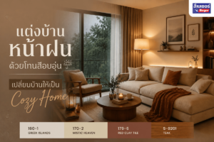
I want to repaint my home decor room, but I still have no ideas in my head, or if I do, I can’t decide which color to choose. One color seems too little, and multiple colors make me worry about matching. Today, with BEGER paint, we have tips on using color to transform the look of your room to make it look good, as if a professional interior designer did it. Let’s take a look at these 11 ideas.
1. The 60-30-10 Rule
A simple proportion that always works.
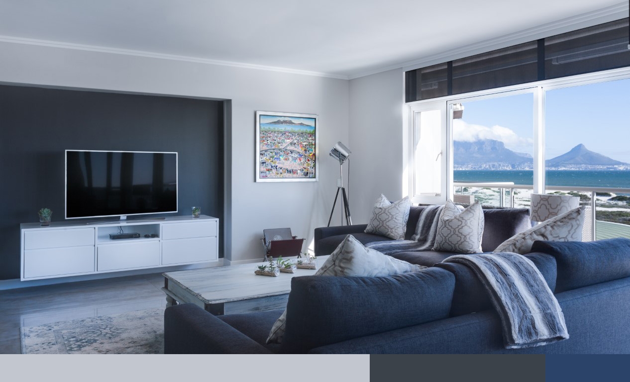
The 60-30-10 theory is a standard principle for using color that anyone can easily apply, whether you are a new homeowner or a professional designer. Choosing one color to paint the majority of the room and then contrasting it with a darker or more prominent shade will help make the room look playful, creating an interesting dimension in the decorative walls. This method is suitable for those who want their room to have color but do not want it to be too overwhelming or filled with color. For the remaining 10% of color usage, we can apply it to crown moldings, windows, or as elements of decorative furniture, cushions, and curtains to create a beautiful color balance.
When choosing to paint a bold or bright shade on one wall, avoid walls with windows or walls obstructed by furniture, as this will reduce the beauty of the decorative wall. It is best to choose a wall that is full and has a striking view, such as the wall behind the headboard, the wall behind the TV stand, or a hallway that people pass through. You might also enhance it with stylish decorations like picture frames, vases, or lamps to make it look complete and harmonious.
Choose a primary color for 60% covering most of the area.
Highlight one wall with another 30% in a darker or brighter color.
Add eye-catching elements with furniture or decorations for another 10% in a different color weight.
2. One Color in Room
Using one color throughout the room can also look beautiful.
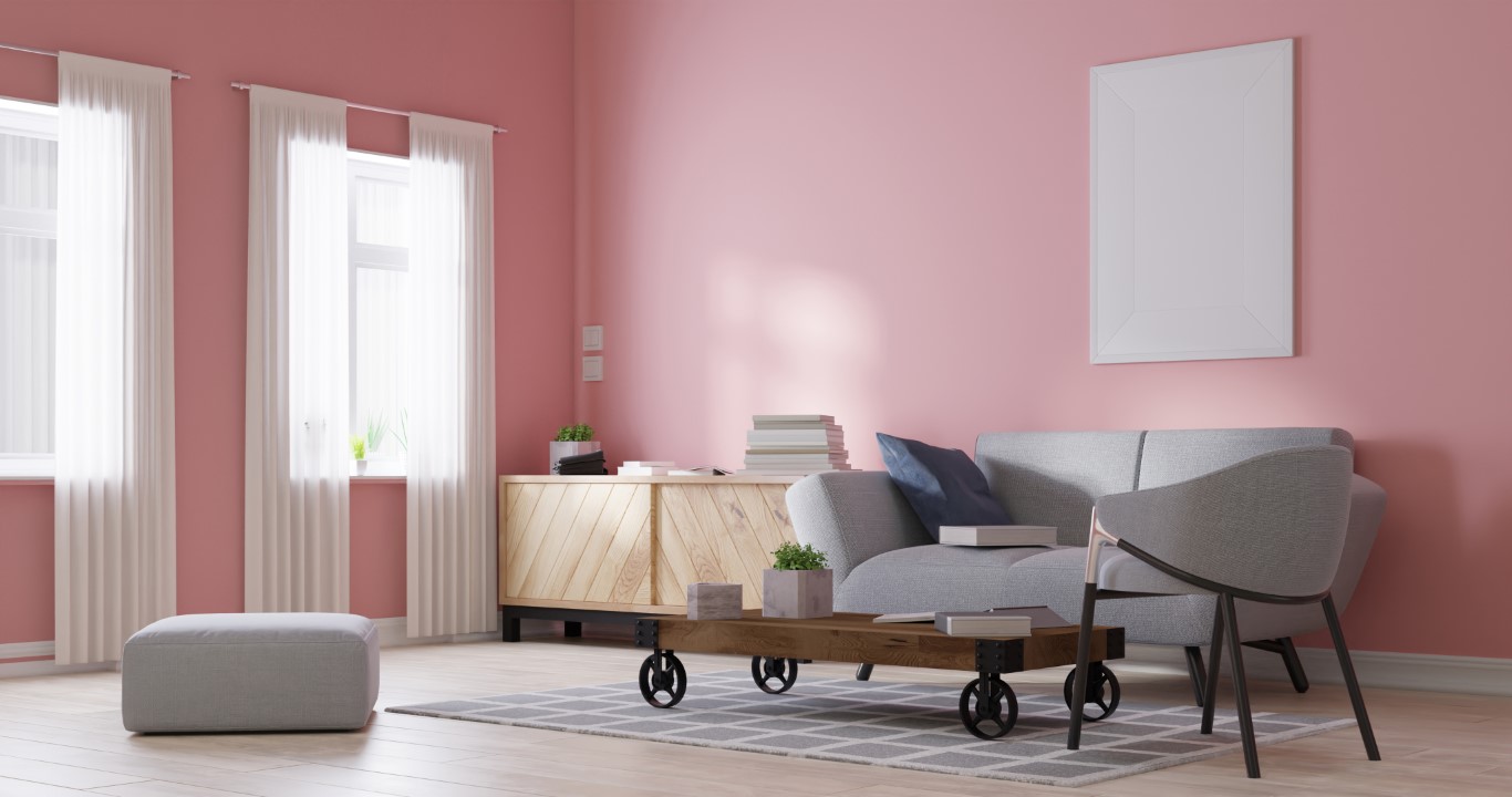
The method of painting with two colors, light and dark, is currently popular due to the fact that Thai people are still hesitant about using vibrant colors and have only recently started to shift from using white, light colors, and cream in their decor. Thai painting choices often lean towards lighter colors to balance the weight in the main area, subtly introducing color into the home without being too bold, gradually familiarizing themselves with experimenting with colors. Thus, the term two-tone has become a popular style for painting homes, both indoors and outdoors today.
If you try to change your perspective and dare to use colors you like by painting one color throughout the room in the style of Western home decor, it will create a beautiful atmosphere filled with artistic flair, resulting in an attractive style that feels visually rich and satisfying without needing to decorate with many additional pieces of furniture, as the color itself becomes the main artwork of the artistic composition, standing out clearly on its own.
3. Change Color, Change Space
Adjusting the brightness of the color can change the perception of space.
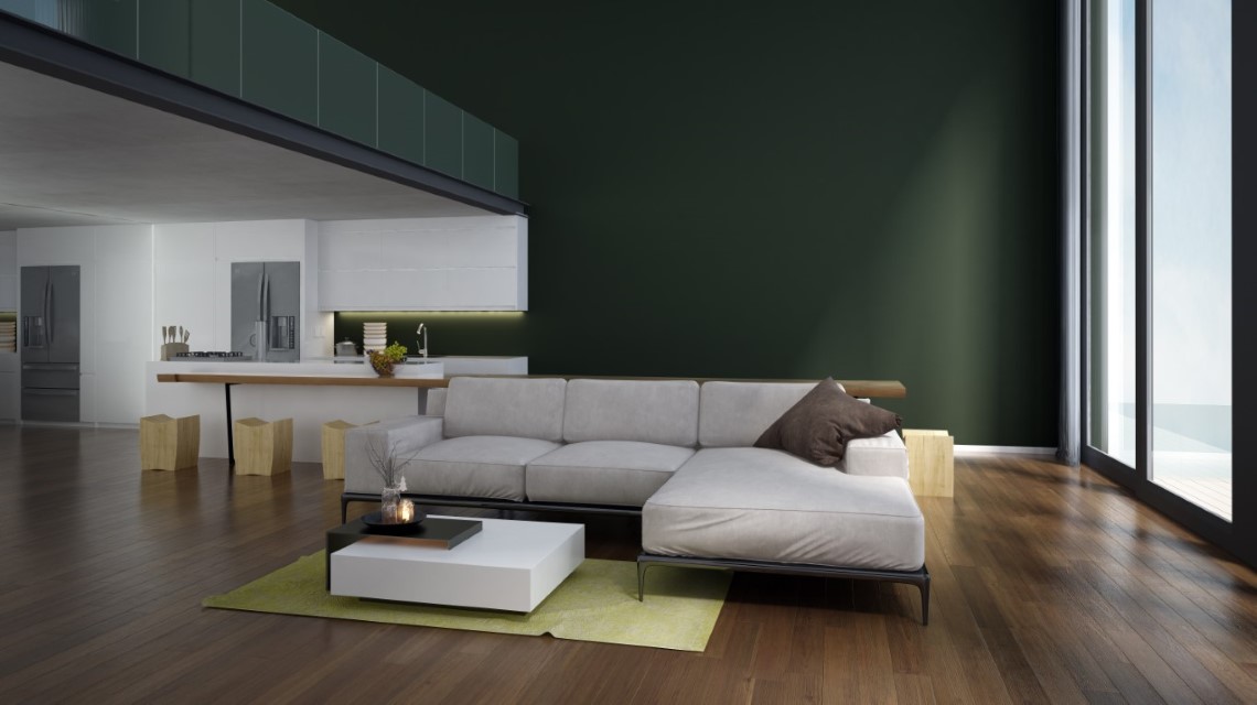
The lifestyle of the new generation has transformed large houses into simpler living spaces that utilize space effectively. Rooms and homes are being limited in size, with condominiums and townhomes becoming prevalent. For those who want a small room with limited space to look more open and comfortable, choosing lighter colors with higher brightness will help reflect light, making the room appear larger and more visually comfortable. However, sometimes using colors to create an illusion of space may not be necessary for those who want stylish home decor; trendy shades might be a better answer for creating an impressive atmosphere with a unique personal touch.
For spaces that appear vast and lack focal points, using a darker color on one wall can help draw the eye closer, creating dimensions that prevent the room from feeling excessively large and empty, while also adding visual appeal.
Small rooms can feel larger simply by choosing light, soothing colors.
While in very large spaces, adding depth with darker colors
can also help create dimension without feeling empty.
4. Roof Comes First
Choose the roof color first.

For choosingexterior painthouses are often constrained by the roof color chosen earlier in the construction process, as painting occurs after the structural work, being a decorative task. Sometimes we may have a color in mind that we like or one that suits us, but we must also consider whether the color we like goes well with the previously chosen roof color. The roof is a component that has a relatively large and prominent area, as it is at the top of the house, thus having a significant influence on the selection of color groups that should go together.
If possible, try to think about color alongside the structural process to break the constraints of roof color and arrive at the most pleasing color. Additionally, other decorative materials such as brick, wood, and tiles should also be considered to ensure they have a color tone that harmonizes with the house itself.
Most houses typically have the roof color determined before selecting the house color.
In addition to choosing colors based on preference, it is also important
to ensure that the chosen color harmonizes with the roof color as well.
5. Upper be Lighter
Light on top, dark below: the formula for a beautiful house

The popular color scheme layout for Thai houses today is to divide the painting into two layers, with the upper layer typically using a lighter color and the lower layer being a heavier color. This approach prevents the house from looking too flat and creates a beautiful dimensionality. This method can also be applied to single-story houses by painting a darker base color for the house about 1 foot to 1 meter high. Homeowners can easily design and apply this color layout themselves. If using a vertical color layout, it is considered another modern style suitable for new modern-shaped houses, but it may require experience in achieving the right balance of colors.
Painting the entire house in one color is not wrong; it can create an atmosphere that makes the house look unique and clearly styled with vibrant colors. However, care should be taken in selecting colors that match the house’s design, and there should be contrasting trim colors for eaves, door and window frames, or perhaps painting wooden wall decorations in a different color weight. Additionally, incorporating elements of other materials such as natural stone or wood can create rhythm and prevent the look from being too flat.
6. White Trimming is “Right” but “Not Always”
White trim is “easy” but not always “the best”
Many people, after selecting the main color for the house and rooms, often choose white for various trims because it is easy to decorate with, requires little thought, and matches every color. Choosing colors for the room and house already takes enough time.
White is indeed a color that pairs nicely with other colors and is easy on the eyes, but if you take a little more time with the smaller elements, try playing with colors for the frames and window sills, eaves, and crown moldings using tones that are harmonious yet have more weight, or with colorful tones. These small elements can become highlights of an important art piece, creating a unique decorative style that adds dimensionality and vibrancy beautifully.
White is often chosen for trimming moldings, sills, windows, and eaves
because it easily matches every color and is easy on the eyes.
Try changing your mindset and daring to play with colors to add interest to these elements.
It may be a bit more challenging, but the result is a striking beauty that is unique.

7. Light Affects Color
Light changes color
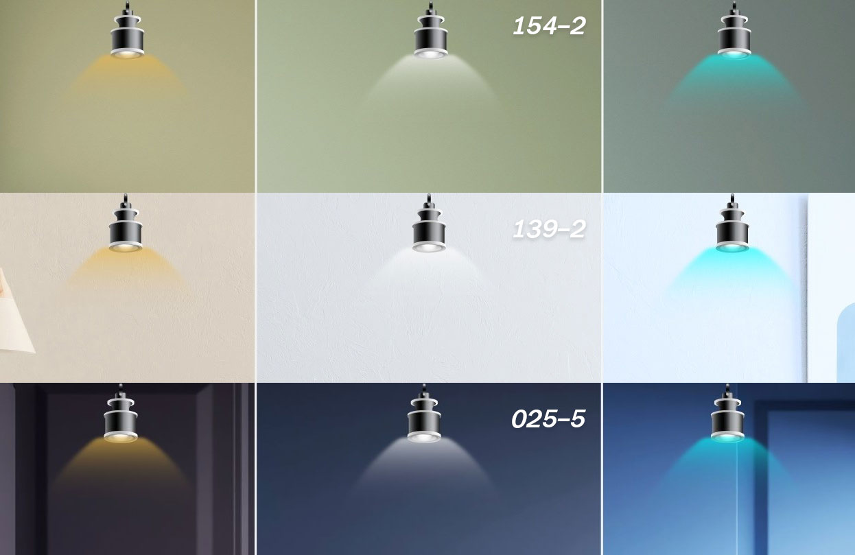
Many times we choose colors from a color swatch, but when applied, they feel different. One factor that contributes to this discrepancy is the lighting, both inside and outside. Light is a crucial factor in seeing the correct color. When colors are applied under orange light, incandescent bulbs, or daylight-simulating bulbs, the resulting effect mixes warm light, making the colors appear yellow or orange. In contrast, under white light, such as fluorescent lighting, colors will appear cooler. For this reason, light illusions are used in supermarket displays; meat sections are illuminated with warm light to make the meat appear redder, while vegetables and fruits are placed under white light to keep them looking fresh. The illusion of color with light in a room is similar.
For natural outdoor light, the sides of a building that are exposed to light and those that are not will show different color weights, even though they are the same color. Therefore, to see the most accurate color values, color swatches should be viewed under the actual light conditions intended for use, or if painting outdoors, one should understand the natural light that may alter the perception of color values.
Light is a factor in seeing colors differently.
The same color, when applied in rooms with different lighting, such as orange light or white light
The results of the color we see will vary
8. Start Practice “Monotone”
Pairing colors, starting with the same tone, no mistakes
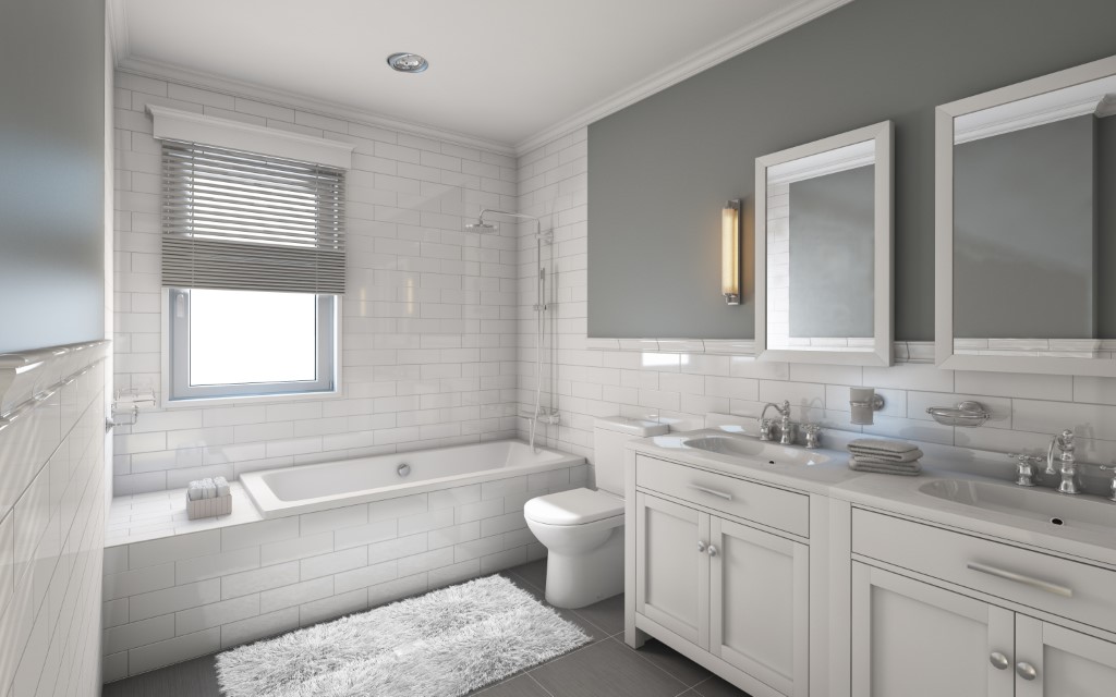
The principle of choosing beautiful colors is not too difficult for homeowners who are experimenting as new designers. The method of pairing colors in a Monotone way is simple and minimizes mistakes… By looking at the color swatches, choose to pair light and dark colors on the same swatch or on adjacent swatches, not exceeding 3-4 swatches. This is because they are similar tones and do not create visual conflict. One of the paired colors should have a higher value of white mixed in or a higher brightness value, to create a clear difference in weight. Choosing the same or similar tone colors with different brightness values will help make the home look harmonious and easy on the eyes… The different color weights will help create playful design elements that are easy and beautiful, applicable both inside the room and the house.
Playing with multiple colors from different tone groups can also create a very impressive atmosphere, but it requires experience and advice from experts to ensure that the arrangement of shades is harmonious and not too conflicting or harsh.
The easiest color pairing choice for beginners is to use colors of the same tone.
By selecting color pairs from swatches that are on the same sheet or nearby sheets, but with different color weights.
No matter how amateur a designer you are, this method is beautiful… no mistakes.
9. Cut off what you “Dislike”, to find the answer you “Like”
If you can’t choose a color you like, try to find out what color you dislike.
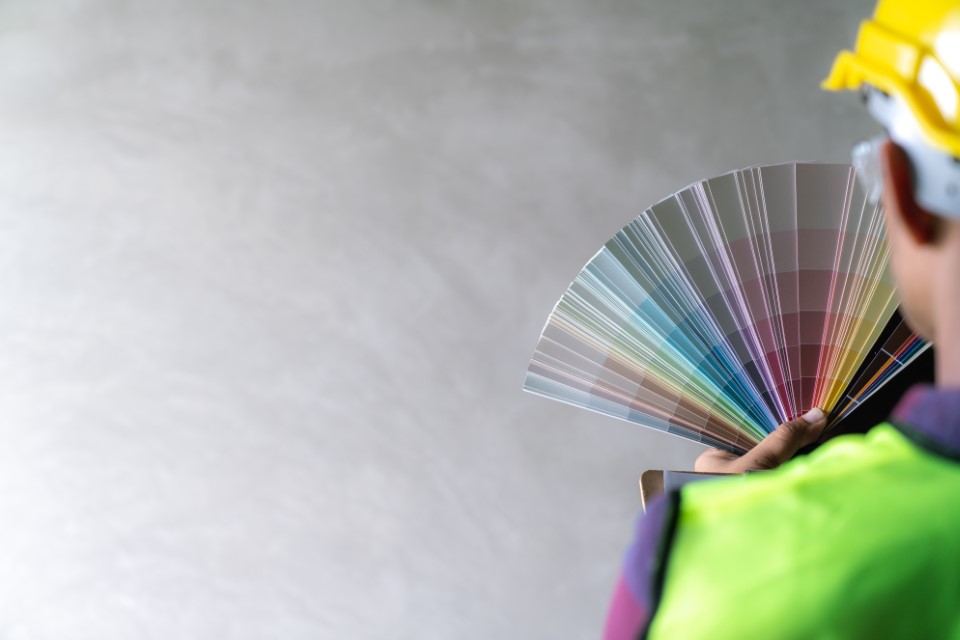
Many people encounter the problem of wasting time choosing shades from a thick color swatch book with over a thousand shades, where every color looks beautiful, making it hard to decide when they can’t figure out what color they like and what suits their home decoration. Try gradually eliminating options that are not suitable and not liked, little by little. The decision-making options will gradually be focused to find the right color answer more easily.
If you still can’t decide, don’t forget about our excellent service. We have a team of expert color designers ready to provide advice on choosing beautiful colors for your home, with experience that understands your needs.
The problem of not being able to decide on a color is still a common issue in painting that wastes time.
Choosing a color can take a lot of thought… If you can’t decide what color to paint.
Try to change your approach and ask yourself what color you dislike, and gradually eliminate options.
The thick color swatch book with over a thousand shades will leave you with only a few suitable options, making it easier to decide.
10. the “Right” Method of Color Output
The results of the color must be viewed when dry and applied twice.
The result of seeing the correct shade of the paint must be viewed when the paint is dry. If we apply paint to the wall and it is still wet, do not rush to read the color values, as they may appear lighter or darker than in the swatch. When the paint dries, it will yield different results from the wet paint, and the dilution of the mixture also affects it. If too much water is mixed in, the color will not show up properly because the dilution causes the paint to not fully cover the background wall color, resulting in a mixture of the background color and the applied color, distorting the color value. Therefore, water should only be mixed enough to make it easy to brush.
Painting the required number of coats as recommended also affects the appearance of the color. If only one coat is applied, the paint will not appear dense enough to reveal the true color. It is generally recommended to apply two coats after priming to ensure the paint is thick enough to completely cover the original wall color. Or if it is a dark shade, a lighter color may need to be used as a base coat to make it easier for the dark color to show up.
Do not be alarmed when the shade applied is not what you expected.
Follow the steps correctly, wait to see the color again when dry, and apply two coats.
Then you will see the change in the visual results of the correct color. ng
11. Care Beauty and Happiness
See the beauty and the feeling.
ColorNot only does it showcase physical characteristics that provide beauty, but it also has many effects on living environments, whether in homes or public spaces. Using it to decorate shops and restaurants also influences the feelings of all users, as different colors have Meaning Some colors that look beautiful at first glance may become uncomfortable over time. Some warm colors may seem inviting, but prolonged exposure can lead to feelings of boredom or dullness. Exploring the emotional impact of colors on the residents, who have different tastes and preferences, is therefore a variable that must be considered in decision-making. Some rooms may be suitable for bold colors and playful hues, while others may require more relaxing or calming shades. The intended use of the space is thus an essential factor to take into account.
Decorating with different shades in each room of the house can create a vibrant atmosphere, helping to change the mood each day. This makes each area of the home diverse in ambiance, not boring, and allows for a happy living experience every day.