H Y G G E
The Color of Happiness
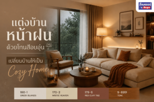
Hygge (pronounced hue-guh) is a Danish word that literally translates to “warmth.” If we were to define it in English, it could be likened to the word Cozy, which means warmth, comfort, and contentment. Hygge is a philosophy of creating happiness and comfort in the present moment, appreciating the little things, and bringing joy to each day, or in another sense, it comes from the word Hug, conveying the idea of embracing and comforting.
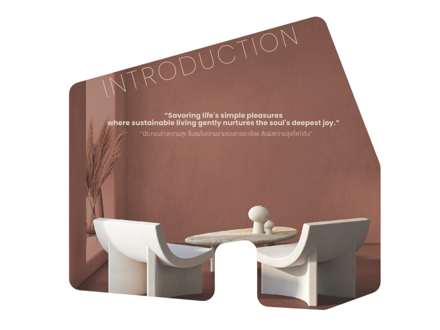
Hygge is not about grand events but about creating a space of happiness for oneself each day. It may start from the environment around us, fostering relaxation of both body and mind, or the warmth of being close to family and close friends in a space called “home,” which leads to sustainable happiness.
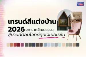
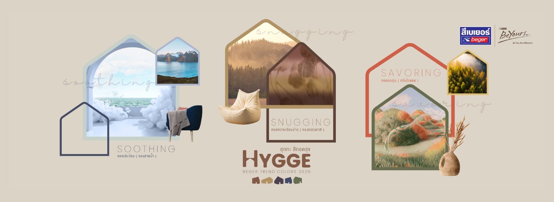
This is the origin of the concept Color Trends in 2025 from BEGER with the word “Hygge” and 3 color groups that inspire “Soothing / Snugging / Savoring”
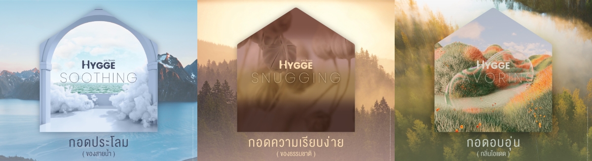
SOOTHING | SNUGGING | SAVORING
Shades of the Year 2025
The light brown shades reflect the warm embrace of simplicity and comfort, which will remain timeless, sustainable, and endless.
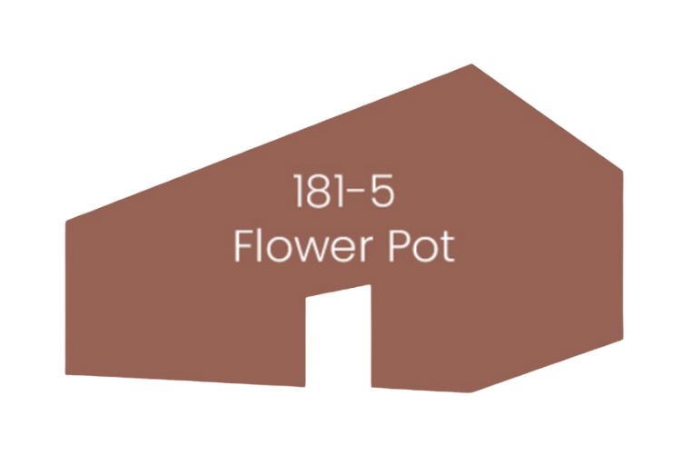
The year 2025 is about creating sustainable happiness. Join us in experiencing moments of fun and joy that surround us, finding value even in the little things to restore balance to body and mind once again.
Create the perfect experience of togetherness that connects us, the people around us, and natural materials into one, while not forgetting to feel gratitude for the people and good things around us that truly uplift our spirits.
Through the 3 main concepts of BEGER TREND COLORS 2025
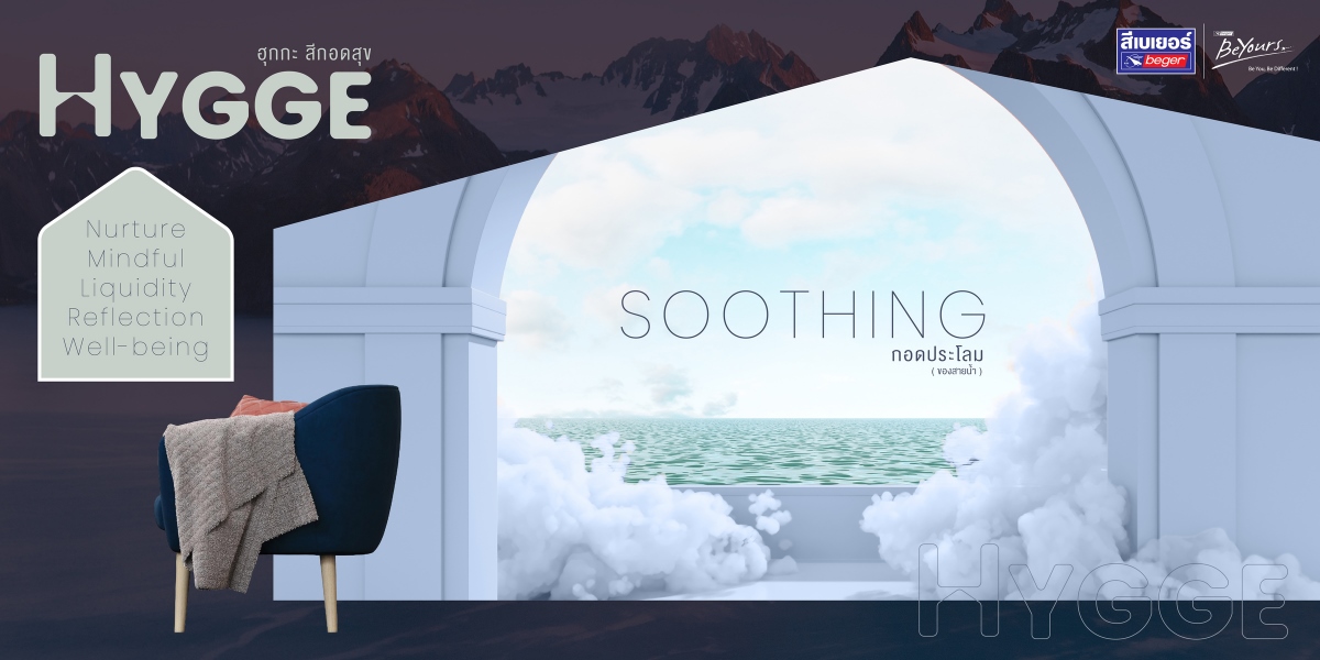
1 – SOOTHING
Gentle comforting The water line offers refreshment, relaxation, and immersion in the atmosphere to reflect one’s identity and the charm of steadfastness, allowing every beautiful moment to pass meaningfully.
Keywords : Nourishing, Mindfulness, Comfort, Reflection, and Good Health
Main shades in the Soothing group
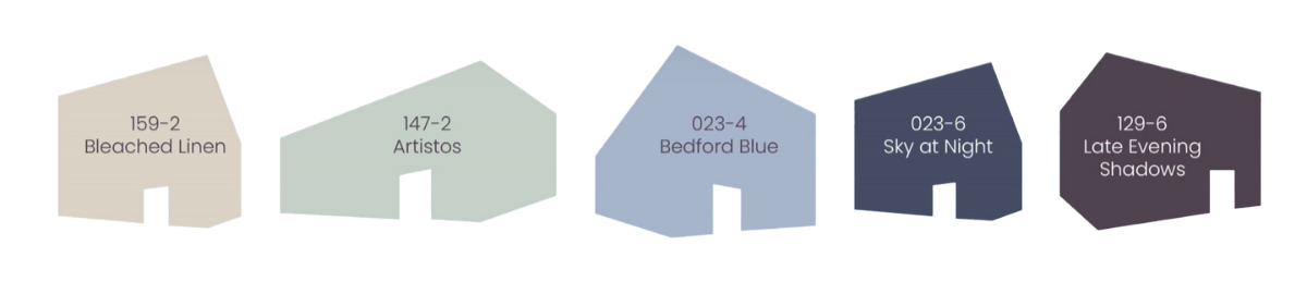
Water color reflects identity Elevating the spirit, reflecting relaxation, experiencing comfort and inner peace, blending creative energy, and creating a refreshing space that is vibrant.
Key colors : Refreshing blue, teal green, turquoise, future blue, deep blue, and reddish-purple with silver reflections that express the desired mental state.
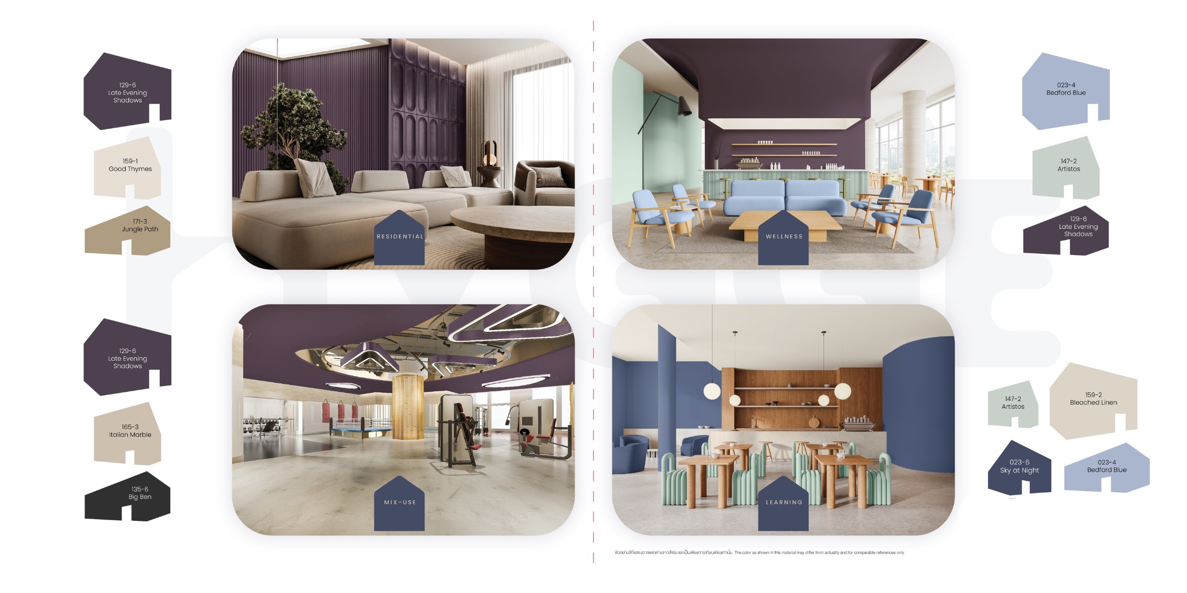
Color examples in 4 Interior areas
Residential / Mix-use / Wellness / Learning
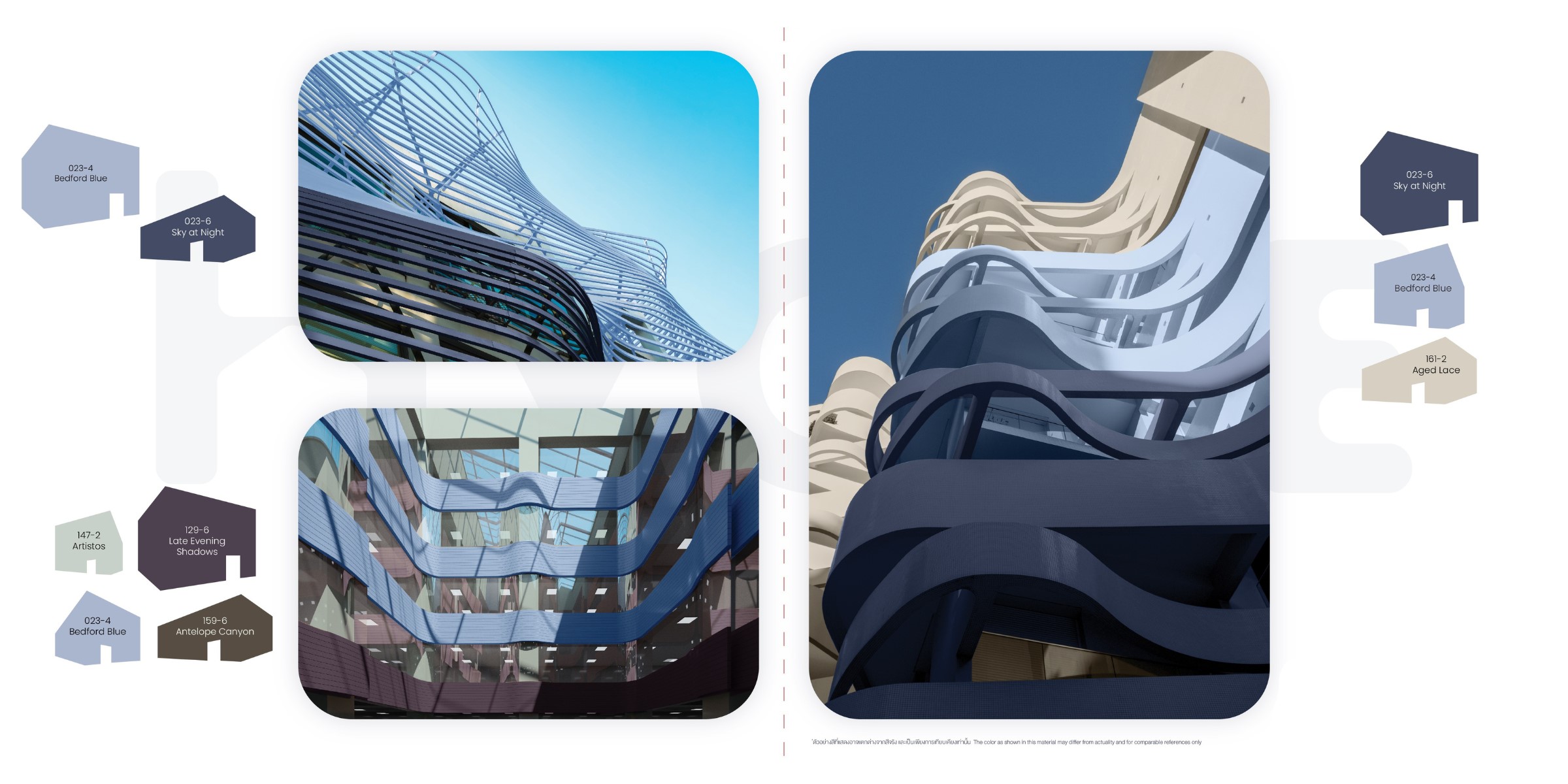
Color examples in Exterior areas
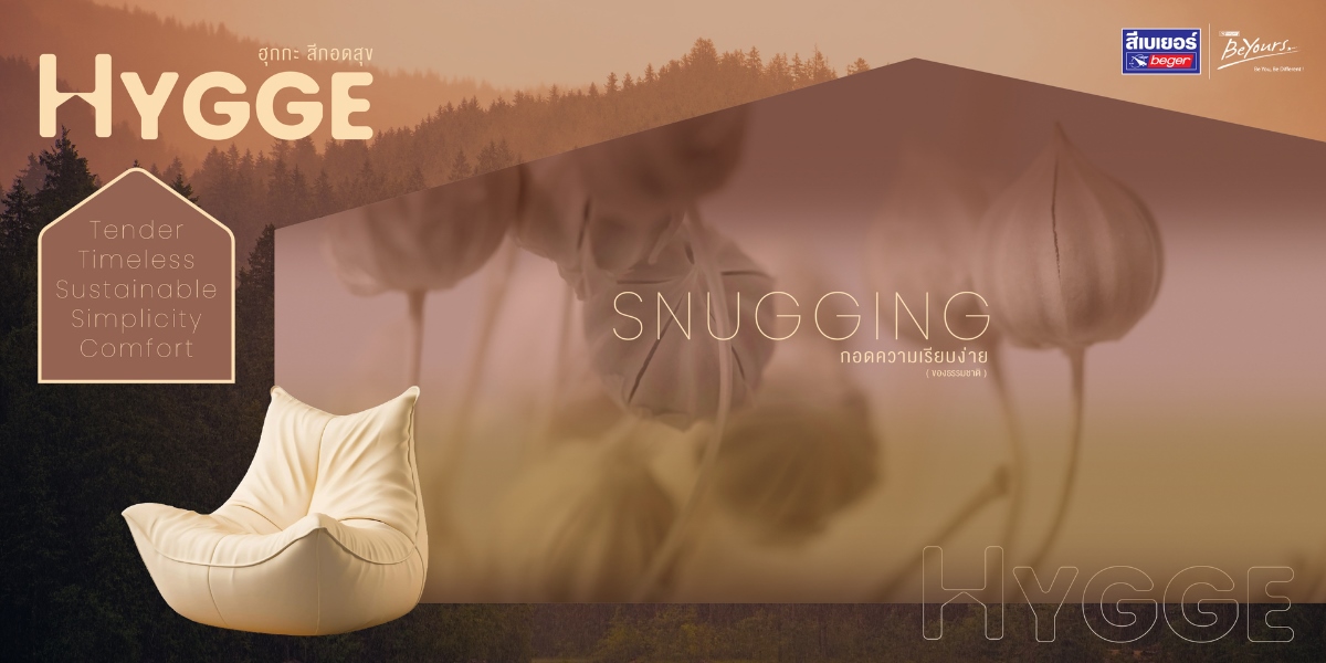
2 – SNUGGING
Embracing new things with joy, greeting the atmosphere, connecting what exists in the present, harmonizing the stories of different eras seamlessly.
Keywords : Gentle, Timeless, Sustainable, Simple, and Comfortable
Shades in the Snugging group
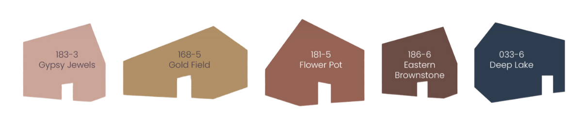
Comforting colors reflect sustainable existence Providing a warm feeling, embracing, and comfort, the neutral tones gently fill the hug with the charm of subtle hues that do not disturb the eyes, are long-lasting, and not easily tiresome, along with earthy colors and natural hues that connect us warmly with all things, allowing the design of residences to be simple and beautifully timeless.
Key colors : Soft light tones, neutral tones, true natural earth tones and beige, simple bright colors, medium blue, and very light colors.
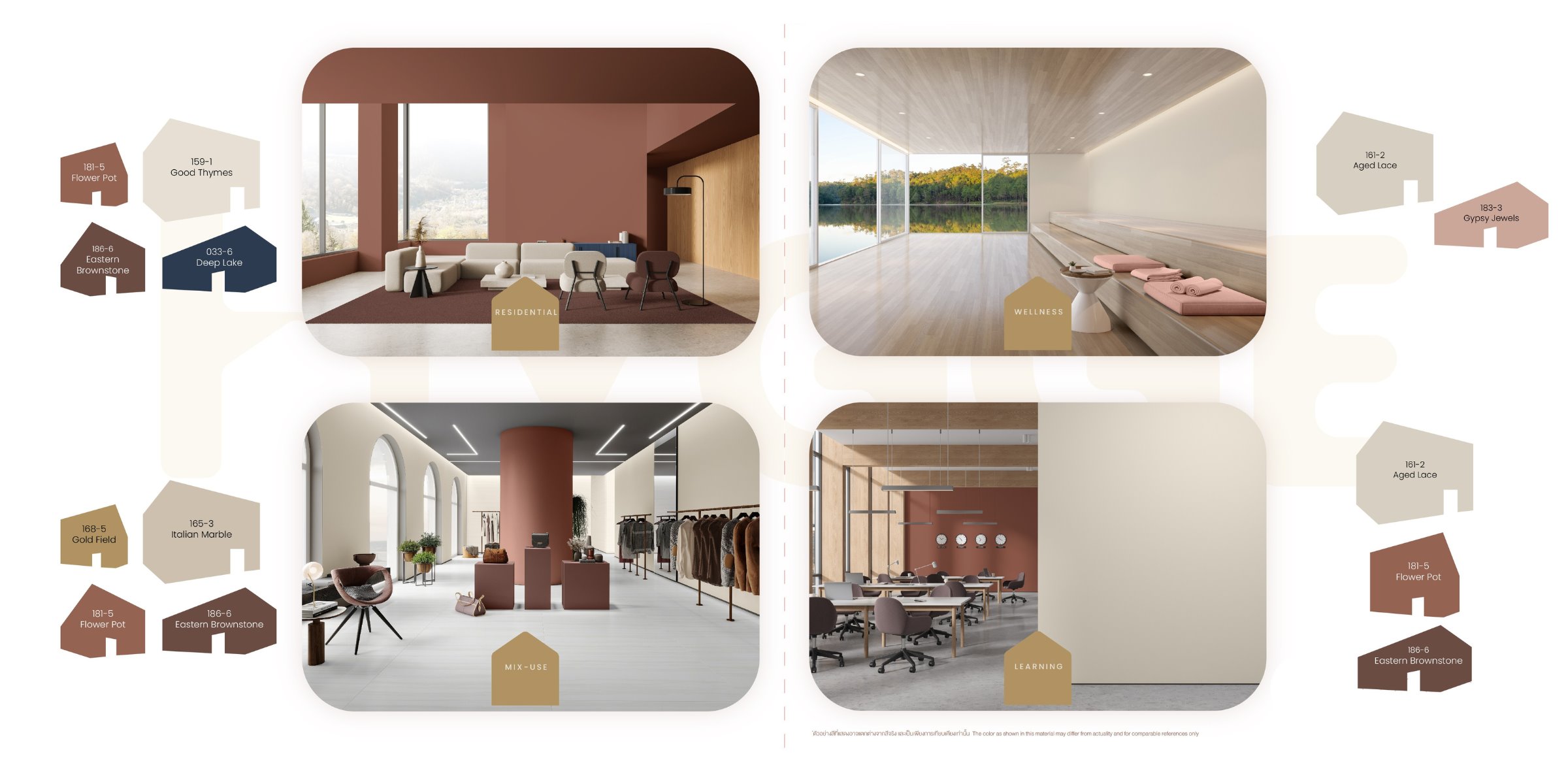
Color examples in 4 Interior areas
Residential / Mix-use / Wellness / Learning
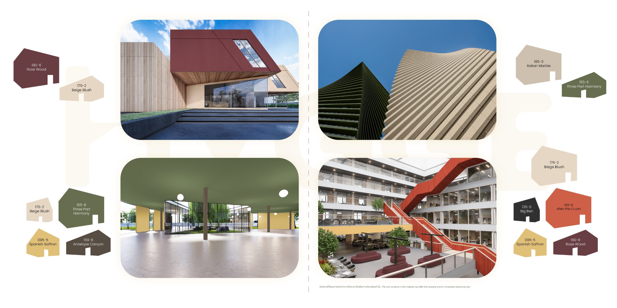
Color examples in Exterior areas
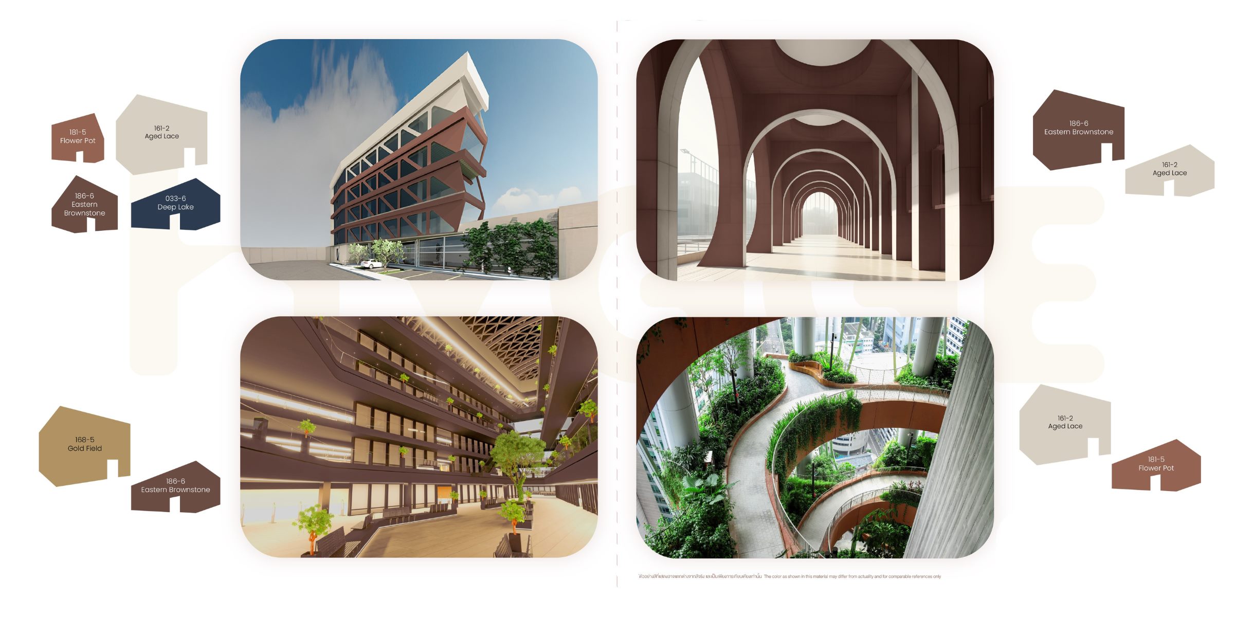
3 – SAVORING
Blooming under the shining sun, surrounded by the vast ocean and gentle flowing rivers, sustainability arises from the connections to the tropical nature.
Keywords : Fun, sunbathing, harmonious, warm, and connected
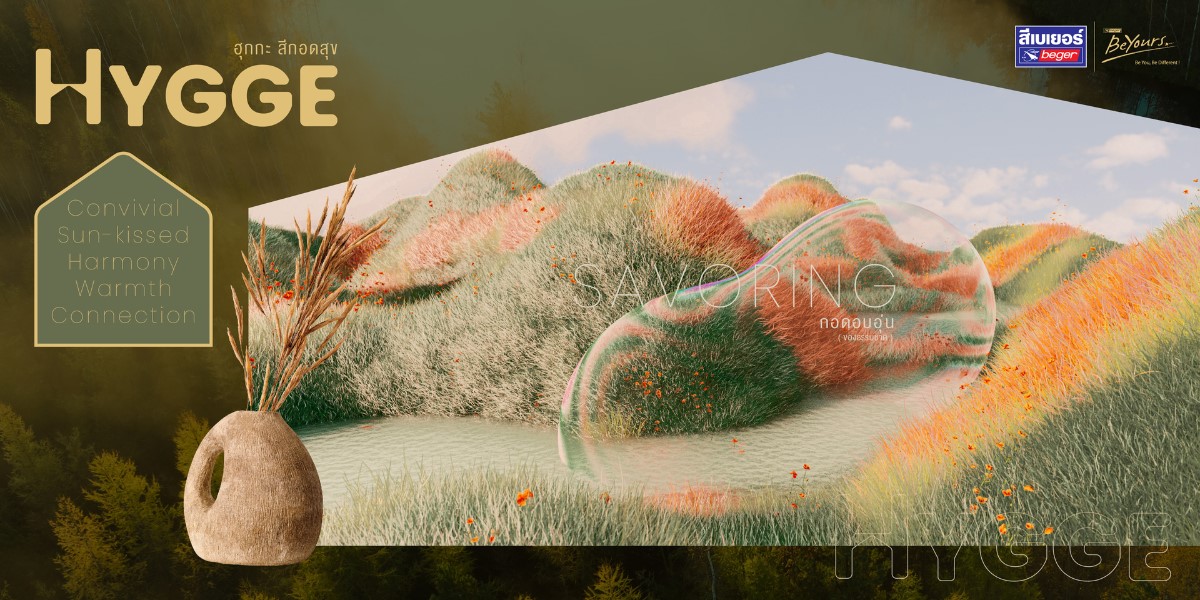
Shades in the Savoring group
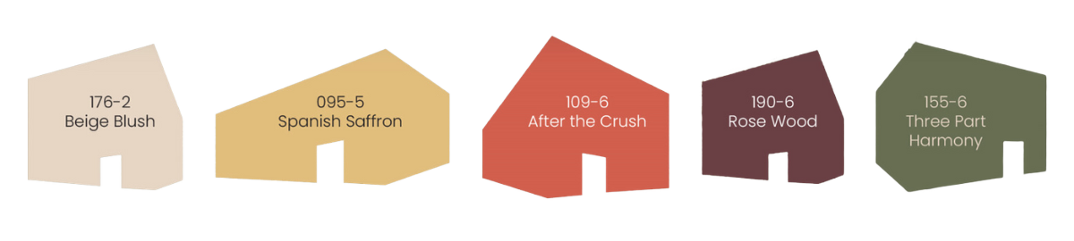
Bright colors reflecting the essence of the tropics Provide a comfortable feeling that energizes vibrancy amidst the heat and bright sunlight. The color tones narrate the warm touch of sunlight, the expansive ocean, and the flowing waters that bring moisture, helping to create refreshing and relaxing energy while retaining the lively fun of the tropical climate.
Key colors : Warm tones, rich tropical colors, clean colors, green, contrasting colors, purple-red mixed with silver (sunlight reflecting on the ocean surface), playful mid-purple, coral glazed sunset, deep yet easy on the eyes, and coral red
Color examples in 4 Interior areas
Residential / Mix-use / Wellness / Learning
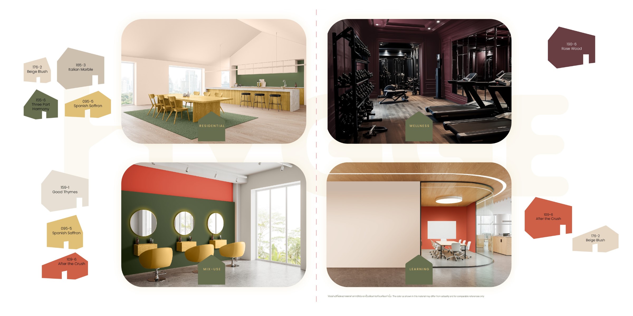
Color examples in Exterior areas
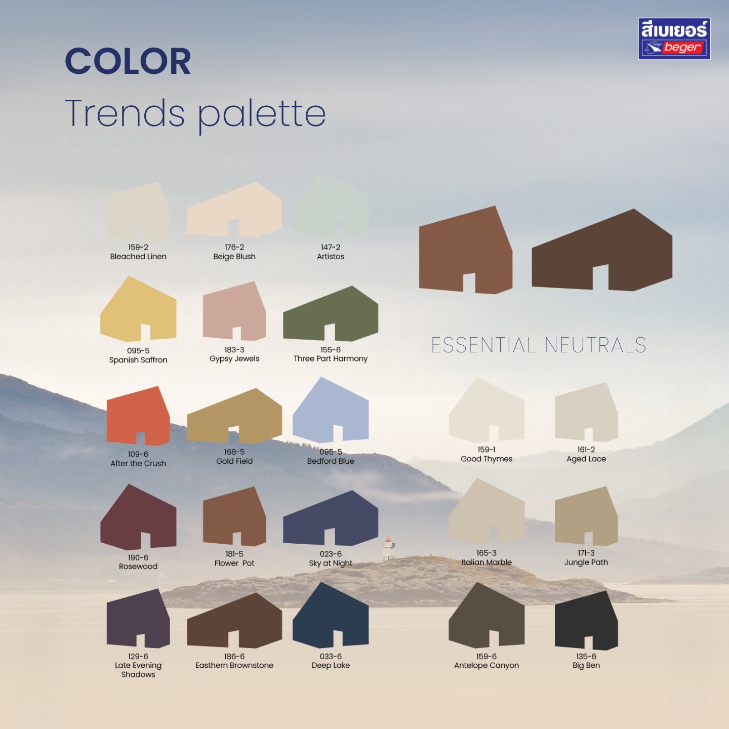
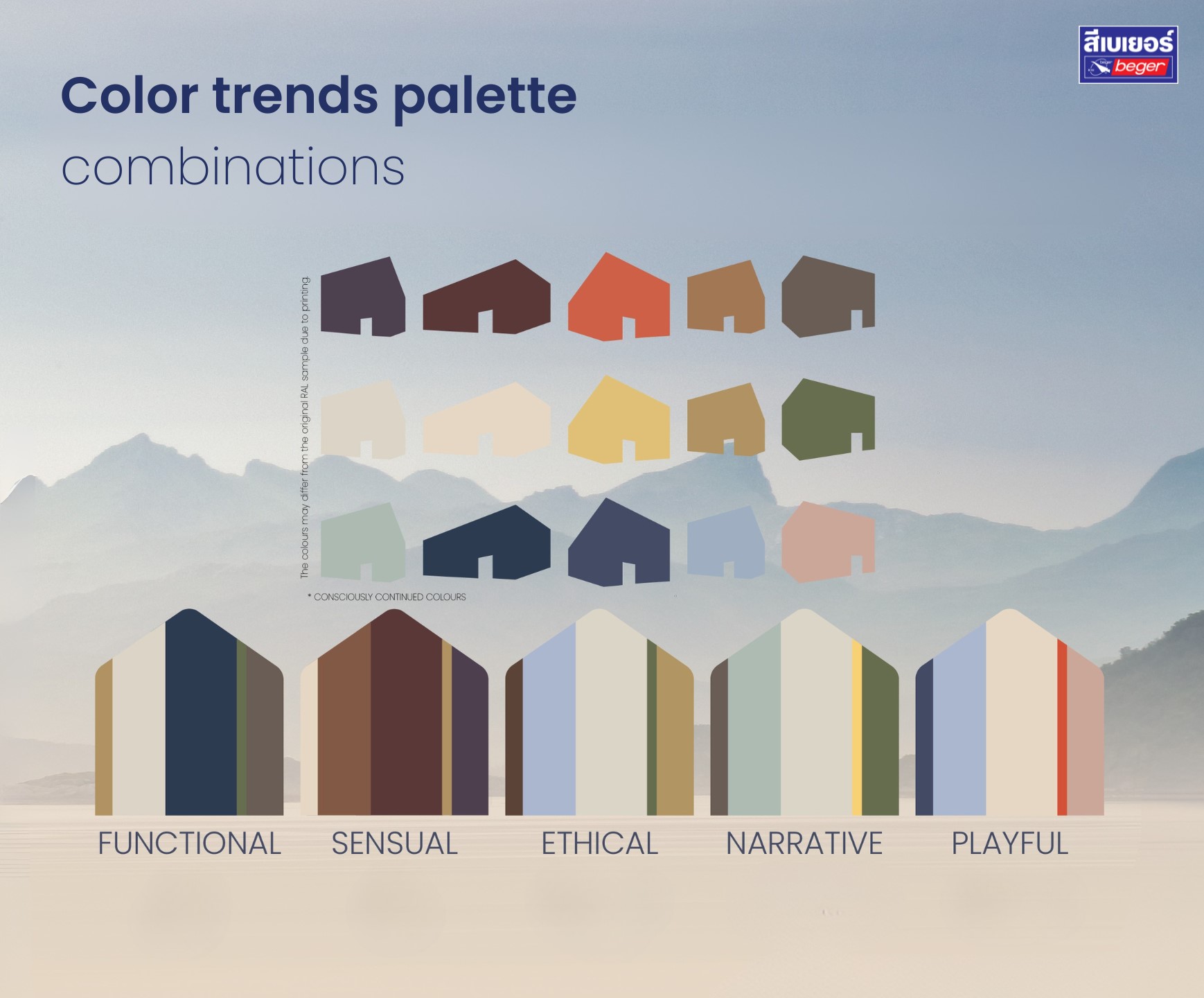
Trends Palette – HYGGE colors embrace happiness with a perfect blend of color pairing
The colors in the palette can be mixed and matched perfectly, and these color inspirations will help enhance the working and living environment in terms of usability, feelings, connections, creativity, as well as physical and mental rejuvenation.
Let’s Find Your Color Trends 2025 with Us,BEGER