
Christmas Tone is not just about the festival, but can become a year-round design concept if the right shades are chosen. The sample room images used red-green in a muted, soft manner, balanced with warm colors, reflect that the “Christmas Tone” can appear luxurious, calm, and livable in everyday life. This article will delve into the concept of each shade, along with reasons why pairing these colors truly enhances the beauty of a room, not just during the end of the year.
1. Deep Christmas Red – Creates a focal point and a warm atmosphere
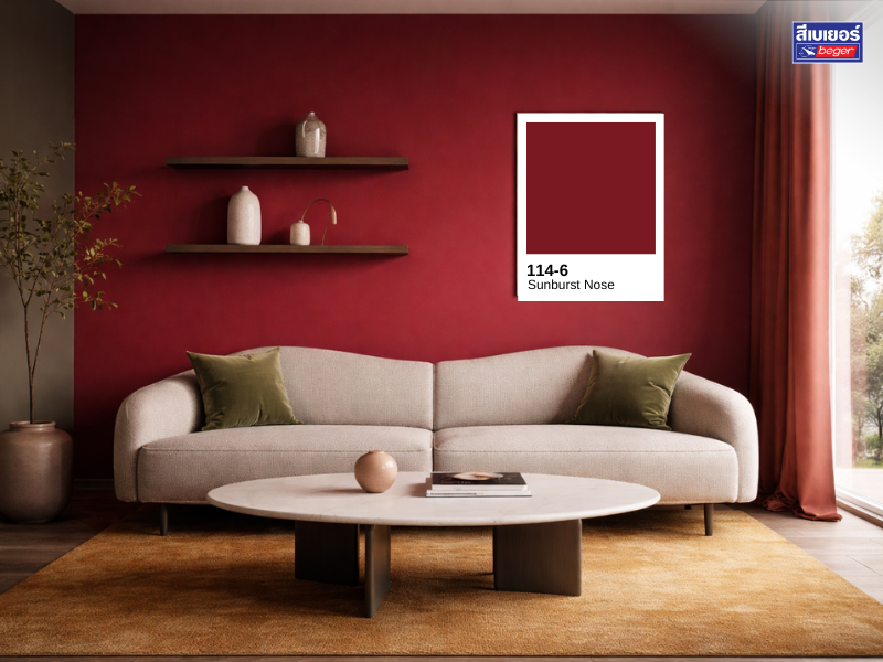
Red in Christmas tones doesn’t always have to be bright red. Shades like wine red or burgundy, as shown in the images, provide a warm, deep, and more luxurious feel compared to bright red. This type of color helps create an “emotion” in the room as soon as it is seen, without feeling overpowering or straining the eyes. Using wine red as an Accent Wall clearly defines the room’s focal point, making it suitable for living rooms or guest areas that require prominence while still maintaining a calm atmosphere. Additionally, deep red shades help elevate lighter-colored furniture, making it appear more luxurious and dimensional.
2. Muted Olive Green – The balancing element that makes a room inviting
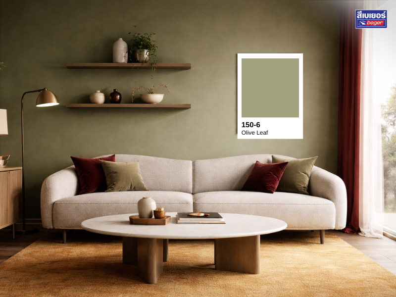
If red represents emotion and energy, muted green embodies calmness and relaxation. Pairing Christmas red with muted natural green helps tone down the room’s intensity, making the overall look more balanced and comfortable. Muted green in Olive or Green Earth Tone provides a nature-inspired feel, making it suitable for use as a wall on the opposite side of the room, shelving, or decorative accents. This color helps seamlessly connect the Christmas mood with modern living, preventing the room from appearing like a temporary theme.
3. Soft Golden Yellow – Adds warmth like light
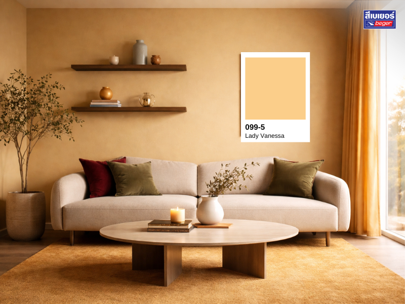
The soft golden yellow or soft mustard color Acts like a light in the room, it is a color that helps enhance warmth and friendliness in the space without overshadowing the main colors. Using this color in small elements like rugs, cushions, or decorations will instantly make the room feel more vibrant and convey a sophisticated, adult Christmas atmosphere. The golden yellow also helps connect red and green together, making the overall look soft and cohesive.
4. Beige–Cream (Warm Neutral) – The base that makes every color look more expensive
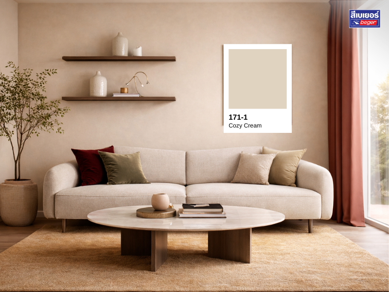
Beige or Cream is the quiet star of the Christmas color palette. Light-colored furniture, like the sofa in the picture, helps reduce the heaviness of red and green, making the room feel airy, comfortable, and practical for everyday use. The Neutral tone also serves as a medium that naturally connects all shades in the room, whether it’s dark walls, gold decorations, or natural wood. The result is a room that feels warm, luxurious, and not cramped, suitable for long-term living, not just limited to the festive season.
Tips for decorating a luxurious and trendy Christmas-themed room
The key to decorating a Christmas-themed room is “choosing shades” rather than just colors. Focus on muted tones of red and green, avoid overly bright colors, and limit the number of main colors to no more than 3–4. Choosing materials with a matte texture, such as fabric, wood, or ceramics, will help soften the colors, instantly making the room look more expensive. When complemented with Warm Light, the room will appear even cozier, with depth, and be inviting both day and night.
Summary: A Christmas palette that lasts beyond one season
Designing a Christmas-themed room doesn’t have to be limited to the end of the year. By cleverly selecting shades like wine red, muted green, soft golden yellow, and beige, you can create a warm, luxurious, and practical space all year round.
Product Recommendations
|
|
|
|